

Different businesses, different looks
Each of these sites started with who it's for and what they need to do when they land on it. The look came after that.
Under each one is its design system: the colors, type, and shapes that keep every page consistent as the site grows. Scroll through and notice which one you'd want to click around in.
Live Bold, Travel More
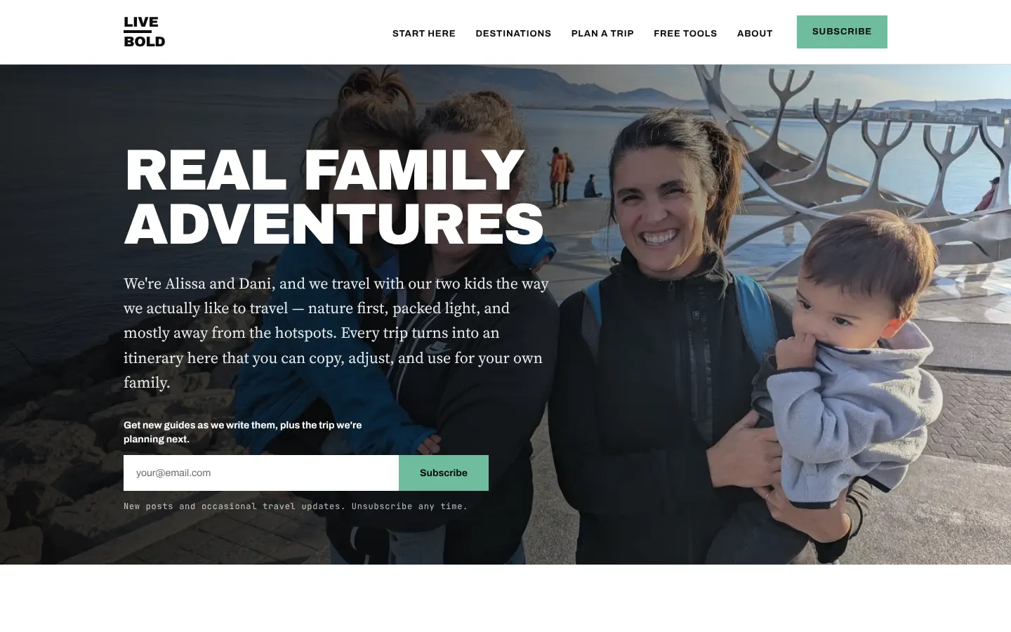
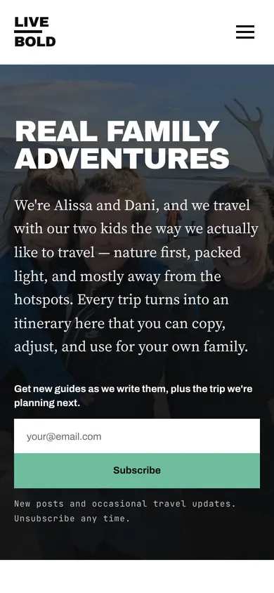
Real family adventures for parents who travel with kids: nature first, packed light, and mostly away from the hotspots. Every trip becomes an itinerary readers can copy for their own family.
Heavy all-caps headlines over full-width trip photos, a book-style serif for the long reads, and a typewriter-style font for small labels. Square corners and one sea-green accent for Subscribe.
Huelistic Health & Wellness
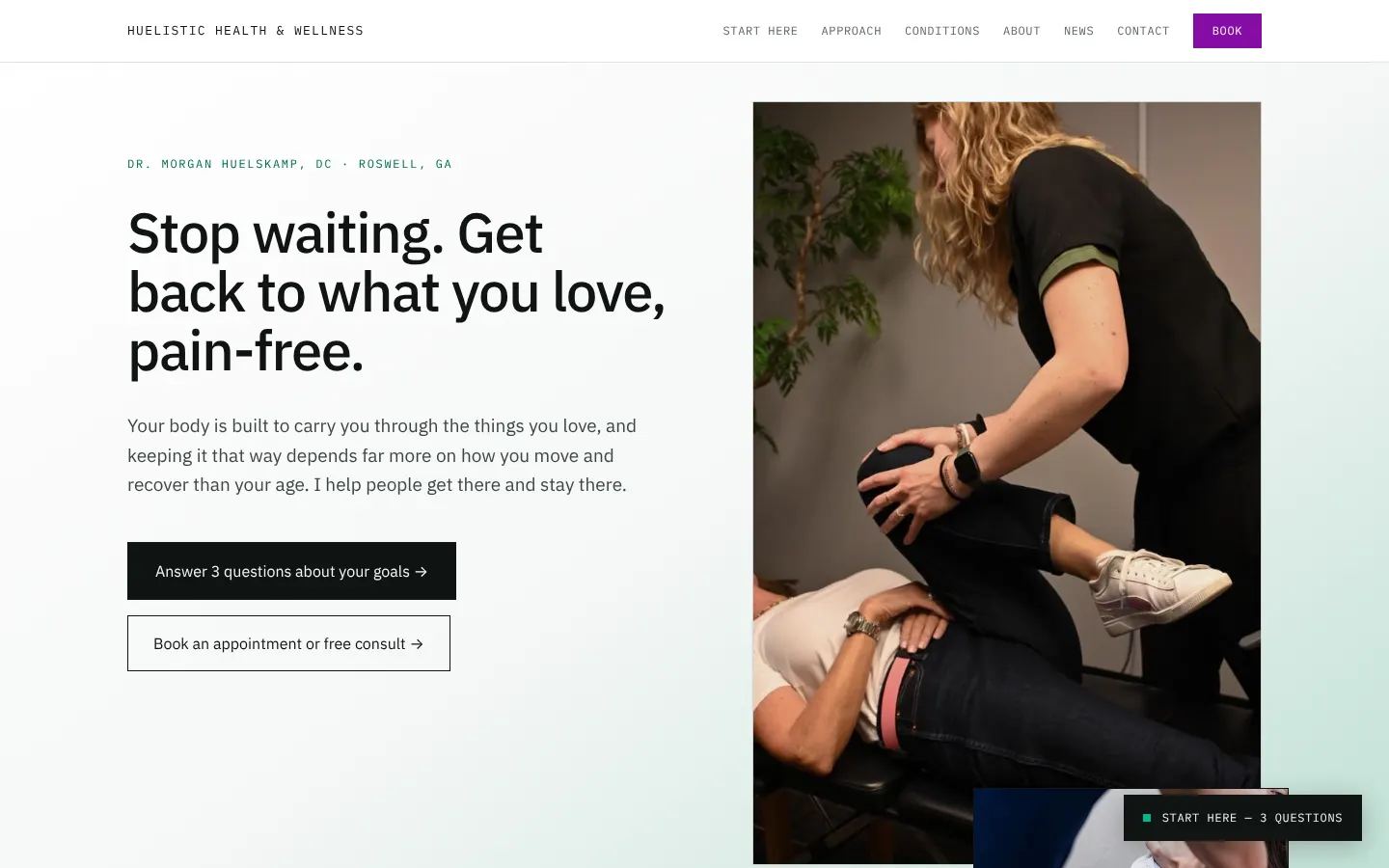
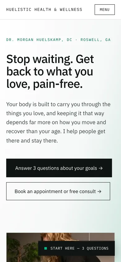
A chiropractor in Roswell, GA. Her patients want to get back to running, golf, and picking up their kids without thinking about it.
Square corners, one typeface family in three styles, and near-black text on a pale green-gray. Purple is saved for the Book button, so the one thing patients need to find is the one thing that stands out.
North Georgia Farmstands
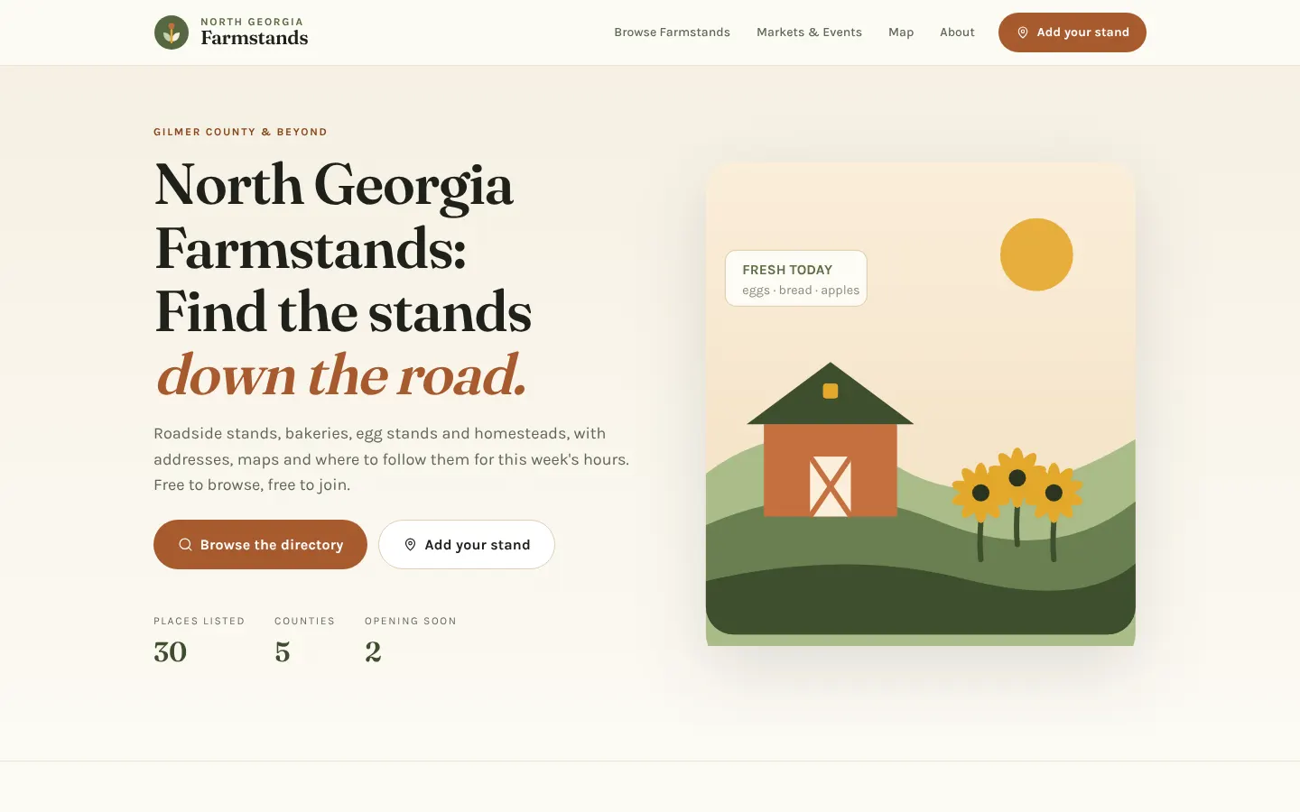
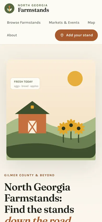
A free directory of roadside stands, bakeries, egg stands, and homesteads across North Georgia, with addresses, maps, and where to follow each one for this week's hours.
A soft serif headline with an italic accent, pill-shaped buttons, and a palette named after the things on the stands: oat, moss, clay, and honey.
Capacity Command Center
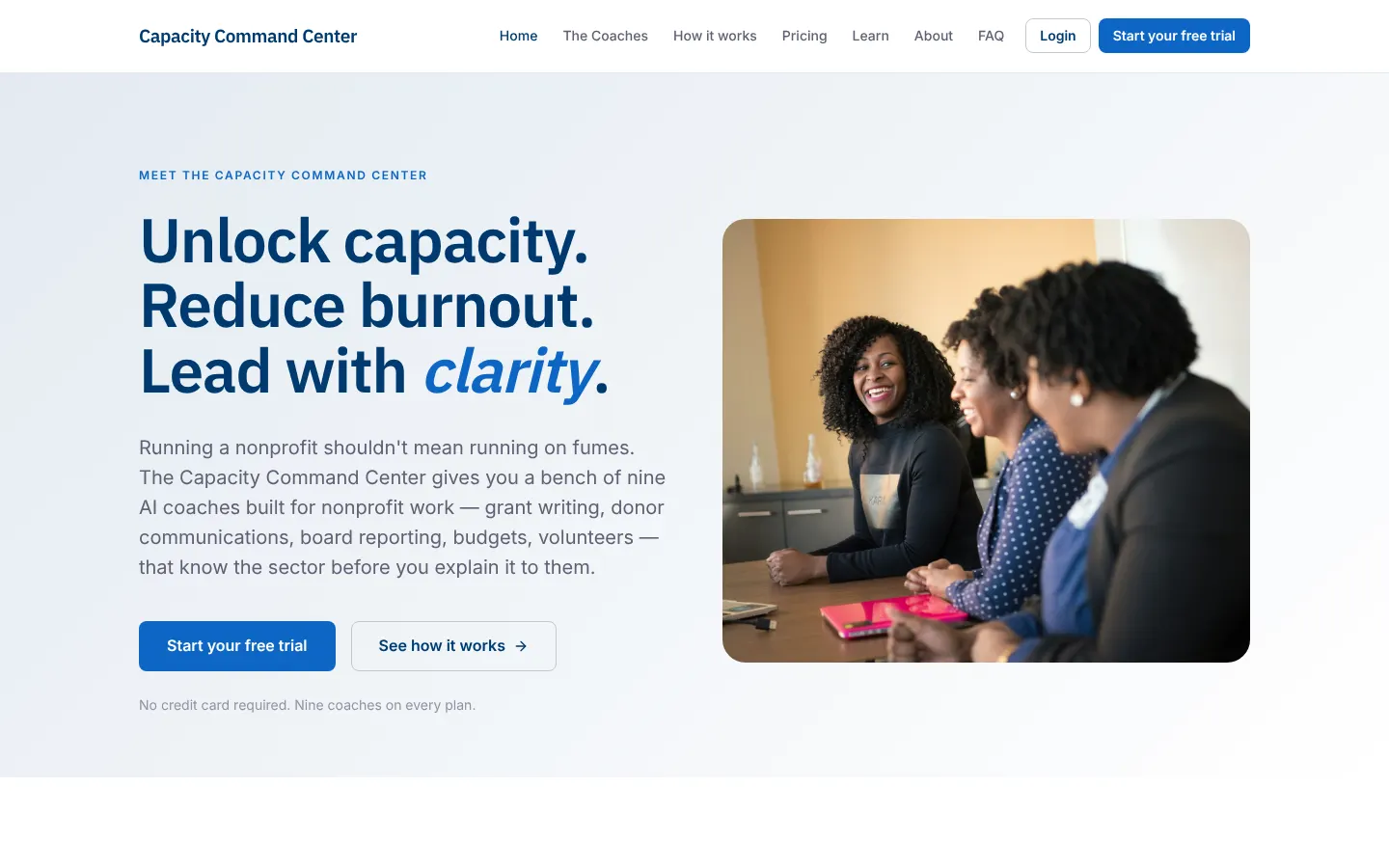
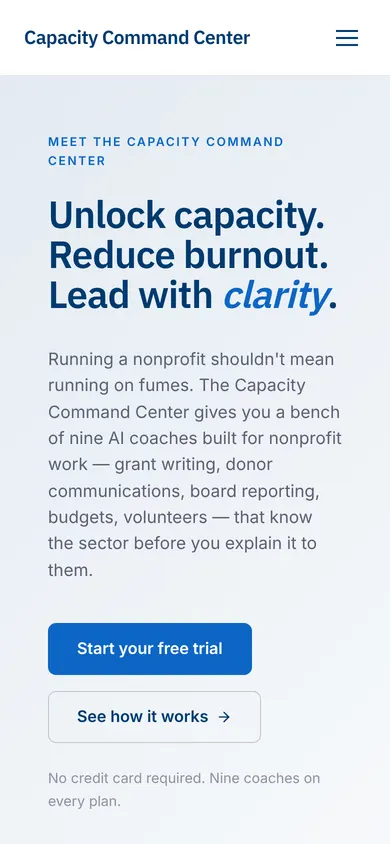
Nine AI coaches built for nonprofit work: grant writing, donor communications, board reporting, budgets, and volunteers.
Navy headings, one bright blue for every action, and a green accent used sparingly. Medium-rounded corners and two plain sans-serifs.
You don't need to know what style you want before we talk. Tell me which of these you'd want to click around in, and what your clients need to do when they get to your site. We'll start there.